When was the last time you took a good look at your dashboard? Not just a glance over the charts and graphs to see what is in red. Does everything make sense? What is all this data? What does it mean? Is it still providing my company with value?
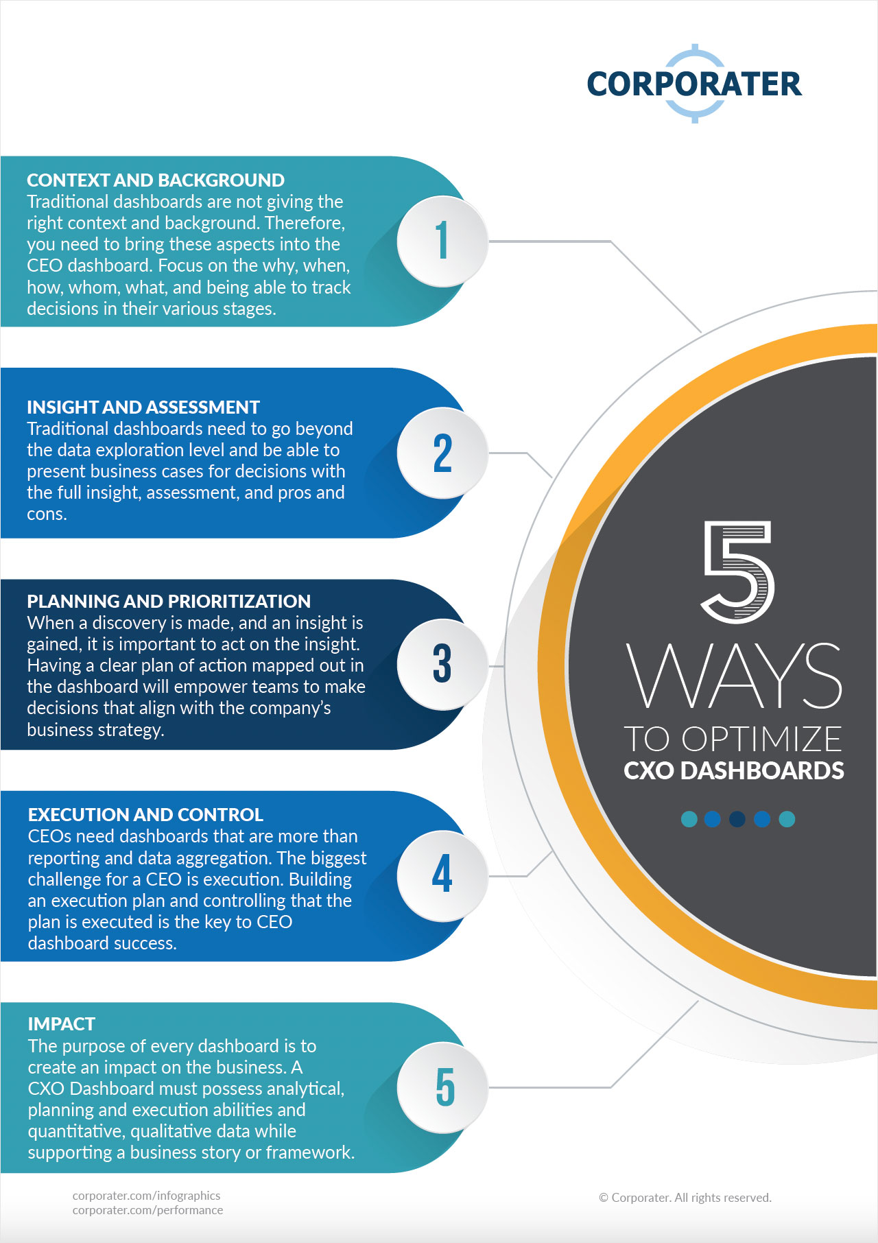
Here are five ways to optimize CXO dashboards to gain the right insight, context, and data needed for managerial decision-making.
Download a copy of this infographic.