
Why is it that some people quickly embrace their BI system and others find it an exercise in frustration? If you are in the user group that finds BI intuitive and extremely powerful, you are fortunate. For the rest of us, it’s an exercise in frustration. Why?
It has to do with the fact that most BI dashboards are filter-based. BI filters the data you are exploring and when you change the filters, analytic graphics are updated. For an analyst, this is a tremendous tool. Fair enough, but is this approach to exploring data appropriate for all users of a BI dashboard? In our opinion – no.
There are different user groups that consume information differently. The analyst is looking for patterns in the data and can handle many filters without being overwhelmed. But when top level managers are exposed to a lot of filter and navigational options, things quickly become too complicated for their needs. The very thing that makes BI powerful for an analyst is what makes it frustrating for business managers. That is why we advocate serving business managers with a business dashboard and the data analysts with a data dashboard. These are different from each other and serve different purposes, even though the underlying data is actually the same!
- A Business dashboard tells the business story in a way that makes sense to a business manager
- A Data dashboard (with filters and drill down capabilities) empowers an analyst to explore and gain insights into the underlying data
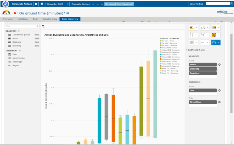
The thing to remember is that there is the interplay between both types of dashboards so that the intelligence (the “I” in BI) is connected to business (the “B” in the BI). In Figure 1 you will see a Data dashboard – this is a traditional “BI view” with all the filters available to enable an analyst to perform complex analysis to understand and explain performance to others. In this view, the analyst is exploring a measure “On ground time” to get insights regarding why performance is as it is. Are there variations based on airport, crew, aircraft type, a day of a week, etc.?
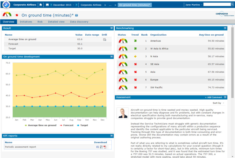
If you already have a BI system in place – great! You are halfway there. The next step is to contextualize the insights from your Data dashboard into an actionable business dashboard. Figures 2 and 3 are examples of a business dashboard where the business story is told. As you can see there are no filters except for a time selector. The navigation reflects the business model the manager uses.
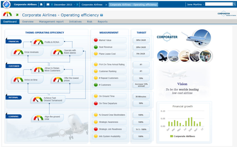
The manager can navigate to a measure that interests him/her such as “On ground time” and understand the business results as well as the actions that are being taken to impact the results. Here the manager can:
- See the results and how they trend over time and against targets
- See benchmarking against other organizations
- Use a guided drill down (without confusing filter options)
- Read the qualitative assessments from others, including from the analysts
- Assess the performance of initiatives that drive the measure
- Download reports
- Submit a request for more detailed analysis
Corporater Business Dashboards can be completely and easily customized, so your business customer sees exactly what he needs to see in the way he or she wants to see it.
No longer it is either/or. With Corporater, you can have both business and data dashboards. It’s time for the B and the I to come together at last.
Learn more about Corporater Corporate Dashboards & Data Automation.