
Introduction
Nearly all modern organizations today use data visualizations in their practice. Data visualizations, such as charts, graphs, and heat maps, are commonly used in business intelligence (BI) and data analytics dashboards, and you also often see them in company presentations, reports, and marketing collateral. Using data visualizations makes data easier to understand and, if used correctly, enables organizations to tell their data story, uncover insights, see trends and patterns, identify areas for improvement, and make informed, data-driven decisions.
There is no doubt that using data visualizations yields many benefits, however, with so many data visualization options available, selecting the right ones can be tricky.
In this article, we provide practical advice, tips, and best practices on how to choose the right data visualizations for your dashboard, so that you could facilitate better data understanding and effectively communicate your data story.
Let’s start with the basics.
What is data visualization?
Data visualization is the representation of information and data through the use of graphical elements such as charts, graphs, plots, histograms, risk heat maps, and others. Data visualization is a key component in data analytics as it simplifies the task of reviewing large amounts of complex data and enables users to extract actionable insights needed to achieve their goals.
What is the purpose of data visualization?
The purpose of data visualization is to present data in a way that is quick and easy to understand.
In most organizations data comes unstructured from various sources and in various formats. Data visualization is a great tool to create order out of this chaos. It enables organizations to present insights from vast amounts of complex data in a clear way and use them to guide informed decision-making.
Data visualizations are commonly used on dashboards to visualize trends and comparisons, monitor the status of KPIs and projects, and understand outliersand patterns in data.
Corporater Data Visualization Guide
Tips and best practices for how to choose the right data visualizations for your dashboard
Why is data visualization important?
Data visualization is important because it allows us to comprehend large amounts of data and make faster, data-driven decisions. With data visualization, you can efficiently explore your data, understand what your data is telling you, and quickly identify trends, patterns, and relationships. Data visualization also helps us uncover insights that would otherwise be difficult to spot in a raw data set.
Consider the example below:
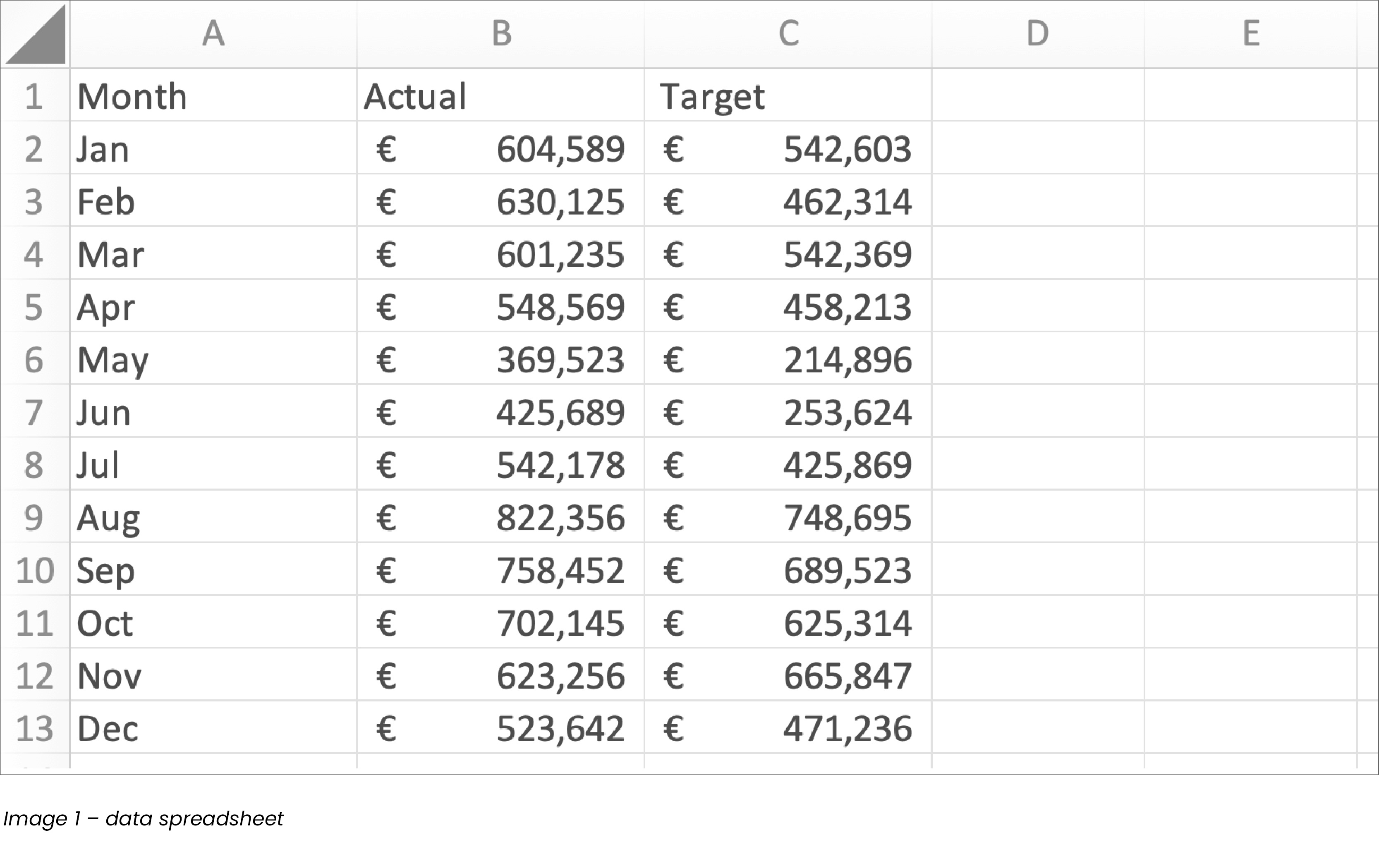
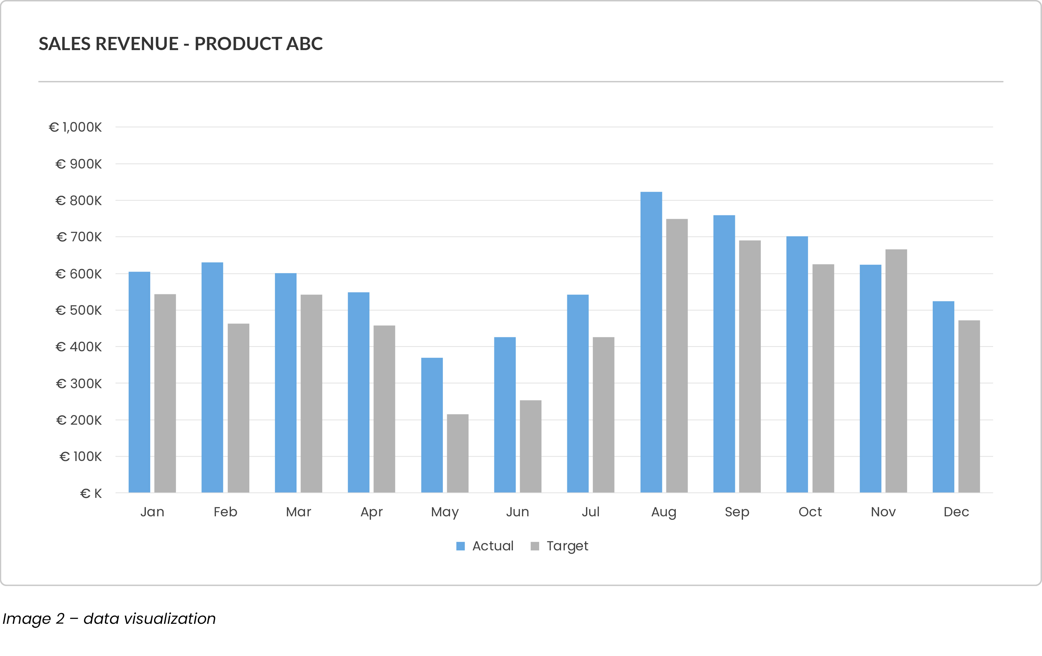
Both images present the same set of data, however, in comparison, data visualization (image 2) makes it faster and easier to understand the whole picture – overall performance throughout the year and comparison of actual vs. target for each month.
What are the benefits of data visualization?
There are numerous benefits to using data visualizations. To name a few:
- Make data easy to understand
Sifting through spreadsheets to find insights can be time-consuming and inefficient. Data visualizations help summarize large amounts of data and present it in a format that is easy to understand for technical and non-technical users.
- Unlock key values
Trying to find meaning in endless rows and columns of data can feel overwhelming even for a trained data analyst. Presenting analyzed data as data visualizations makes it easy to identify key values, pinpoint opportunities, diagnose issues, and uncover areas for improvement.
- Enable faster decision-making
Data visualization enables faster decision-making. As a matter of fact, our brain processes visuals 60,000 times faster than text. When data is properly visualized, it makes it easy for decision-makers to quickly spot trends, patterns, and outliers, and make faster decisions.
- Display complex relationships
Big data often comes from multiple sources and in various formats. Data visualizations, such as scatter plots, make it possible to visualize large volumes of complex data, which enables you to understand relationships and correlations between different data points
- Make data more engaging
People are visual creatures. For most of us, data visualizations such as charts, graphs, maps, or infographics are far more engaging, memorable, and enjoyable to look at than plain numbers and text. Data visualizations enable you to visualize your data alongside context and tell your data story in the most compelling way.
How to choose the right data visualization for your dashboard?
With so many data visualization options available, choosing the right ones for your
dashboard may seem tricky. To take the complexity out of the selection process,
consider this 2-step approach:
- Determine the purpose
To choose the right data visualization, you must be clear about its purpose.
If your data visualization serves no purpose, it only clutters your dashboard.To kickstart the data visualization selection process, ask yourself:“What would you like to see?”
To help guide your answer, consider these common data visualization functions:
- Value – E.g., I want to see a number of open support tickets
- Status – E.g., I want to see the status of our KPIs.
- Comparison – E.g., I want to see comparison of quarterly sales by region.
- Composition – E.g., I want to see composition of our staff.
- Trend – E.g., I want to see trend of units sold by month.
- Progress – E.g., I want to see progress of our strategic initiatives.
- Distribution – E.g., I want to see possible correlation between variables A and B.
- Deviation – E.g., I want to see if there are any outliers from our norms.
- Relationship – E.g., I want to see the relationship of our key value drivers.
- Risk – E.g., I want to see which risks need immediate action.
Don’t worry if your data visualization needs to serve more than one purpose. There are several types of data visualizations that are suitable to serve multiple functions at once.
Once you are clear on “What would you like to see?” use the table in our Data Visualization Guide to select data the visualization that best fits your purpose.
- Ensure your data story
Once you select your data visualization, it is time to ensure that it is in fact the right data visualization for your dashboard. To do so, look at your data visualization and ask:
“What story does your data tell?”
Correctly selected data visualization should make your data story apparent – it should make it quick and easy for users to understand what the data is telling them and whether action is needed. If your selected data visualization does not present your data story clearly, you may want to add more context or explore other data visualization options.
Download our Data Visualization Guide for a quick overview of data storytelling, its importance, and best practices
Pro Tip: Beware of clutter. While context is necessary to tell your data story, too much context may turn into clutter and cloud your information. To keep your audience focused on the most important parts of your data, ensure that your data visualization provides just enough context needed for decision making and eliminate the rest.
Final thoughts
In today’s data-driven business environment, it is critical to cultivate a data driven culture where decisions are made based on facts and insights. That begins with collecting quality data, extracting insights, and communicating those insights to those who need them, when they need them, and in a way that is easy to understand.
Dashboards with carefully selected data visualizations are a great tool to facilitate data access and understanding. They enable users to comprehend large data sets at a glance, visualize their data story, and make faster, data driven decisions that drive value for their organization.
There are many different types of data visualization available, which can make the process of selecting the right ones for your dashboard feel overwhelming.
To simplify the process, consider this 2-step approach:
- Step 1: Determine the purpose – Ask: “What would you like to see?” (status, trend, comparison, composition, distribution, etc.) and then select your data visualization accordingly.
- Step 2: Ensure your data story – Ask: “What story does your data tell?” and then optimize your data visualization accordingly. If your data visualization doesn’t present your data story clearly at a glance, add more context or consider other data visualization options.
Choosing the right data visualization can greatly enhance your audience’s understanding of the presented information. On the other hand, choosing a wrong one may leave them feeling confused and frustrated.
To ensure maximum comprehension, keep your data visualizations clean and simple, choose your colors wisely, label your variables, and ensure that all text is legible. Remember, the purpose of data visualization is to present data in a way that is easy to understand.
Lastly, who better to verify whether you selected the right data visualizations than the people using your dashboards? To ensure that your data visualizations continue to serve your organization well, ask your users for input and optimize your dashboards as needed. A good business management software will allow you to create custom dashboards, visualize your data in various ways, and make ongoing updates as your business needs change.
Happy visualizing!
Corporater Data Visualization Guide
Tips and best practices for how to choose the right data visualizations for your dashboard