Settings
The Settings menu (Global settings) contains these sub-menus:
Portal options
Custom colors
-
YTD enabled default - controls the default value of the YTD enabled property for scorecards. Original default value is "False".
-
Period selection enabled default - controls the default value of the Period selection enabled property for scorecards. Original default value is "Greater periods only".
Changing YTD enabled default or Period selection enabled default does NOT change YTD enabled or Period selection enabled on individual scorecards. It means that if these properties are set to "Inherit" on a scorecard, the properties in Portal options will be used.
If YTD enabled or Period selection enabled have been set in Defaults, those settings will be overridden by the settings in Options.
-
Enable Lock period - select for the period selector to display the Lock period option on Web.
Users can use the option to lock the current period type when they navigate between objects on Web, so that the data that's associated with these objects displays against the same period type.
If the object that the user navigates to or its parent object has Period selection enabled as 'False', the lock becomes disabled and Corporater BMP applies the period type for that object.
-
Remember tab selection when navigating - select the type of tab navigation to be used in the system:
-
when not checked ("off") users will always be directed to the first tab when navigating to a new object (default value)
-
when checked ("on") users will always be directed to the same tab as the one they were last on when they navigated to a new object, if the object they are navigating to has that tab.
When navigating between objects that use different Page setups you will be directed to the first tab in the setup.
When you click an object in the page breadcrumb (navigation path) you will always be directed back to the tab you were on when you navigated away from that object, regardless of your Server Options setting and regardless of the currently select tab.
-
-
Disable all Custom Visualizations - select to disable support for custom visualization objects such as CVO Reporter tags, CVO Server connections, and CVO Table references in Corporater BMP.
-
Initiative and risk assessment breadcrumbs follow affects - select for the breadcrumb trail for a strategic initiative or a risk assessment to display the path of the first object that that strategic initiative or risk assessment affects.
If deselected, the breadcrumb for a strategic initiative or a risk assessment displays the current user’s navigation path to that strategic initiative or risk assessment.
For Corporater BMP versions that are either new installations or upgrades from 5.0.4.0 or previous to 5.0.4.2, this option is selected by default.
For Corporater BMP versions that are upgrades from 5.0.4.1 to 5.0.4.2, this option is deselected by default.
-
Portal name - give the BMP button at the top left of the web a customized name, e.g. the name your organization uses when referring to the system. Default name is "BMP".
It is also possible to customize the Login Page by adding an image/logo or a customized footer text that may contain formatted text, links, etc. Customizing is done in the Login page section of the Control Center. See the Installation Guide for more information.
Locale options
-
Default locale - sets the default language for the entire system. This is the language that will be used if Language is not specifically set for an individual user.
If a right-to-left language is chosen, the screen layout will automatically be right-to-left, both on the web and in Configuration Studio.
-
Override number format - check the box if you want the system to use a different number format than the one used by the default language
-
Locale for number format
-
if Override number format is checked the number formatting of the language selected here is always used, no matter what the user's language is
-
if Override number format is not checked the number formatting of the default language will be used
-
If Override number format is not checked and a user's language is changed, that user's number format will also be changed.
-
-
Calendar type - select from ISO, Persian, Buddhist, or Hijri.
Caution should be used when changing calendar type as activities may no longer correspond to proper time periods.
-
NA - how NA values (Not applicable/Not available, no value) are displayed on the web page
-
NaN - how NaN values (Not a Number, e.g. divided by 0) are displayed on the web page
Example: To display NA and NaN as "0" write "NA=0" and "NaN=0"
NaN and NA are case sensitive.
If you don't want to show anything when values are NaN and NA set NA and NaN to a blank string. -
Available locales - the languages that are available as locales to users on Web.
Each language that you select or leave selected displays in the Language drop-down in user profile settings for users on Web.
To make a language unavailable, deselect it in the list.
Status colors
The Status colors section contains the settings for Status colors. There are four subsections:
Order of status colors
Contains a table where colors can be mapped to relvalues. This makes it possible to rank colors according to your needs. Use the up and down arrows on the right to change their order. What colors are available is defined in Colors.
You should give the status colors/relvalues the order in which you expect to use them and place any you will not be using at the end in order to avoid problems with broken sequence of relvalues. E.g. if you want to use red, yellow, green, and black colors only, move orange and blue to the bottom, below black. This will give a sequence of relvalues from 0 through 4.
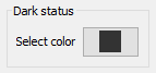
Dark status
In this section, you can define a custom color to use as Dark status color for status bullets, trend arrows, and status gauges.
The Select color drop-down displays a color chooser from which you can select, preview, and save a color of choice.
Once you save a color, it becomes available as Bullet style and Checklist status color item.
Bullet style
In this section the administrator can choose Normal, Symbols, Smileys, Markers, Excel, or Cognos.
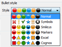
The Status bullets will use the selected style everywhere in the system.
Empty status display
Select how status without values should be displayed:
-
Gray - gray status bullet
-
None - no status bullet
Checklist status colors
Select the status colors to use for Checks. Default values are:
-
Complete = green status
-
Incomplete = red status
Risk
Configure the default dimensions and colors for Risk charts. Choose the number of squares charts should contain, from 2x2 to 8X8, and define the color of each square in the chart.
The default Risk chart in Settings has the dimension 5x5 and contains both Opportunity and Risk. The default chart is configured like this:
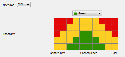
However, it is possible to change the color of each cell in the chart individually, by choosing from the colors in the drop-down list above the chart. Choose a color in the list an click on the cell or cells that should be that color.
 This chart configuration is global, i.e. it will be used in all Risk charts in the system.
 If any of the Risk factors and Function Risk factors that are plotted to the chart are of Factor type "Risk", the
Risk part of the chart will be displayed. If the any of the risk factors are of Factor type "Opportunity", the Opportunity part of the chart will be
displayed. If any of them are of Factor type "Both", or there are both Risks and Opportunities, both parts of the chart will be displayed.
If any of the Risk factors and Function Risk factors that are plotted to the chart are of Factor type "Risk", the
Risk part of the chart will be displayed. If the any of the risk factors are of Factor type "Opportunity", the Opportunity part of the chart will be
displayed. If any of them are of Factor type "Both", or there are both Risks and Opportunities, both parts of the chart will be displayed.
Risk bullet style
If you selected a different Bullet style that 'Normal' in Status colors, the bottom part of the screen will contain a list of Risk bullets, so you can define the bullet style for each color used in the Risk chart. Each row in the Bullet style list on the right is a drop-down list where you can select the style you want to use for that specific color.
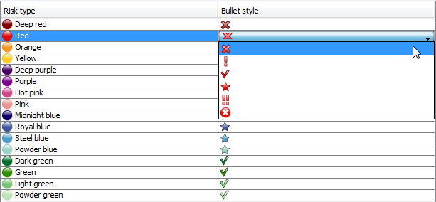
Only the colors you actually selected in the Risk chart will be used as Risk bullets.
Risk labels
Configure the text for each risk scale item on each risk scale in a risk chart.
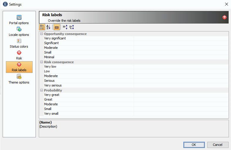
Corporater BMP applies these texts as the default labels for each risk chart. To apply custom labels to a risk chart, use the corresponding properties in the chart's Layout section.
After you upgrade to Corporater BMP version 5.1.0.0, if your database included risk charts with a dimension value other than '5x5' and with specific risk labels,
Corporater recommends you manually adjust these labels.
 If the labels for the Consequence scale are too long, Corporater BMP truncates them on Web. To avoid this, create shorter Risk consequence labels or make the chart
larger.
If the labels for the Consequence scale are too long, Corporater BMP truncates them on Web. To avoid this, create shorter Risk consequence labels or make the chart
larger.
Theme options
You can use themes to customize the look and feel of your Corporater BMP installation.
Custom colors
Configure Corporater BMP to use colors that match your brand guidelines and your company profile.
The colors apply to the following Web components:
-
Primary color - Top bar on Web.
-
Secondary color - Buttons, links, tab names, and current organization in user menu on Web.
-
Surface color - BMP objects on Web.
-
Background color - Blank space on Web.
You can input a color code or use the color selector to define, preview, and apply a unique, custom color.
Table style
Define a table style for Corporater BMP to use consistently on table objects across the application.
The style determines the table row height. You can set tables to use one of the following styles:
-
Compact - Reduced space.
-
Very compact - Minimum space.
Additionally, you can define a font size for text in tables.
The font size is relative to the table style.
Corporater BMP supports any combination of available font sizes and table styles.
By default, table styles are linked to font sizes as follows:
-
'Compact' table style - 12 px font size
-
'Very compact' table style - 12 px font size
Corporater BMP applies your selected font size to each table type object, including its header.