ANALYTICS
Pivot table
A Pivot table enables users to see tabular data in different views on the web. A Pivot table can be given a default configuration in Configuration Studio, but users may also modify the configuration on the web.
With a Pivot table you:
-
Can show content from any table with column based data
-
Can set up columns/rows and values in expandable structures
-
Can filter data on each column/row
How to create a Pivot table
To add a Pivot table right click the object to which it belongs and choose Add -> Table -> Pivot table. A Pivot table may be created in the Templates or the BMP model. Double click the Pivot table to configure it or use the Properties panel.
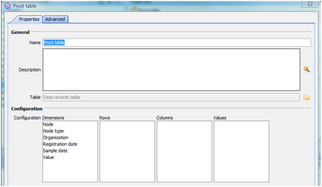
Properties
General
-
Name - the name "Pivot table" is automatically generated but it may be changed
-
Description - an optional text describing the object
-
Table - click the icon to the right and choose the table template to use as basis. You can connect it to any column based table such as Data Records table, Spreadsheet table, Query table, or Filtered list.
Configuration
In the table you should now see that all the visible columns from the selected table are placed in the Dimensions column. This means that they are available to use in the Pivot table. To create a Default view, drag the columns you want to use to Rows or Columns respectively. Values should contain a numeric column.
 Rows, Columns, and Values must all have content
in order for the Pivot table to show anything.
Rows, Columns, and Values must all have content
in order for the Pivot table to show anything.
 The contents of a Pivot table may be language dependent, so we recommend that you assign names to the columns to be used in the Pivot table in the table connected to
the Pivot table. This will prevent BMP from changing the column names to language dependent ones and ensure that the contents of the Pivot table is correct.
The contents of a Pivot table may be language dependent, so we recommend that you assign names to the columns to be used in the Pivot table in the table connected to
the Pivot table. This will prevent BMP from changing the column names to language dependent ones and ensure that the contents of the Pivot table is correct.
Users should click the Reload button on the web to ensure that they are viewing the latest version of the Pivot table.
Visibility
-
Border style - choose the style the object should have:
-
Frame and Title bar
-
Frame only
-
None
-
-
Visible - select how the object should appear on the web:
-
Visible
-
Not visible
-
Only visible for Admin - shows the object on the web only for users with admin user role; this applies everywhere, e.g. breadcrumb, organization tree, page content, Reporter, searching, filtered lists, maps, and Workflow.
This can be useful e.g. when adding new elements to "live" objects.
-
Audit
-
Modified by - the name of the last user to make changes to the object.
-
Last modified - the date and time when the object was last changed.
-
Created by - the name of the user who created the object.
-
Created - the date and time when the object was created.
Advanced
ID
-
ID - a unique ID for the object.
By
default, Corporater BMP assigns consecutive numbers to new objects. You can change the ID to a value of choice that can include either letters or letter and number combinations.
The ID mustn't contain only numbers, include special characters such as ) ( . * } { + < > [ ], or match the name of a default object type in Corporater BMP.
Layout
-
Columns large screen - the number of page columns the object spans across on Web on a large screen device.
-
Columns medium screen - the number of page columns the object occupies on Web on a medium screen device.
-
Columns small screen - the number of page columns the object occupies on Web on a small screen device.
The maximum number of page columns is 6. Hence, for the object to span across the entire page, set the value of '6' for the device type.
For the object to span across half the page, set the value of '3'. For the object to span across a sixth of the page, set the value of '1'.
-
Page setup - click the Page Setup button (
 ) and select a page setup for children objects to the object. The object itself doesn't use the setup. You can create and
configure page setups in Shared web items.
) and select a page setup for children objects to the object. The object itself doesn't use the setup. You can create and
configure page setups in Shared web items. -
Header style - select the header style for the object.
-
Inside - displays the object's name together with the object header on Web.
-
Outside - displays a divider between the object's name and the object header on Web.
-
None - displays the object without its object name.
-
-
Border style - select the border style for the object.
-
Line - displays the object inside a frame on Web.
-
None- displays the object without a frame on Web.
-
-
Shadow - check to display a shadow around the object on Web.
-
Show status as - select which icon to show in the Title bar. You can choose between:
-
Status gauge icon
-
Bullet icon
-
No icon
-
-
Transparency - enter a value for how transparent the object is on Web.
The value range is between '0' to '100', where '100' represents that the object is fully transparent.
-
Header color - click the Edit button (
 ) and select a color for the object header.
You can create and configure colors in Shared web items.
For optimum design, Corporater BMP recommends you don't use bright gradients or transparent pastels as header colors for table headers.
-
Font color - click the Edit button (
) and select a color for the object's text font.You can create and configure colors in Shared web items.
-
Container - click the Edit button (
) and select a container for the object.The container represents the page tab on which the object displays on Web.
You can create and configure containers for page setups in Shared web items.
-
Show on large display - select for the object to display on devices with a large display.
-
Show on medium display - select for the object to display on devices with a medium display.
-
Show on small display - select for the object to display on devices with a small display.
-
Tab - the page tab to display the object on Web.
You can create and configure new tabs in Shared web items.
Visibility
-
Show Menu Button - check if you want the button that opens the Options menu for the object to be available on the web page; among other things, the Options menu contains alternatives for editing and deleting. The contents of the Options menu can be configured in Page setup.
-
Show Icon/Status - select which icon to display in the Title bar. You can choose between:
-
Table type icon - the standard icon for the object
-
Status gauge icon - a status gauge used as icon
-
No icon
-
Access control
-
Read accessors - click the Edit button (
) and authorize one or more users and user groups to view the object on Web. -
Add accessors - click the Edit button(
) and authorize one or more users and user groups to add new objects to the object on Web. -
Write accessors - click the Edit button(
) and authorize one or more users and user groups to edit the object on Web. -
Delete accessors - click the Edit button(
) and authorize one or more users and user groups to delete the object on Web. -
Ownership - click the Edit button (
) and grant ownership of the object to one or more users and user groups. Users and user groups who own the object have full access rights to it.
-
Override access profile - select for the object's access control setting to outrank the object's corresponding access settings in profiles.
Viewing a Pivot table on the web
On the web the Pivot table title bar contains a button  to use to open the Pivot view configuration.
Here users who have been given access can drag and drop columns into Rows and Columns, and put a numeric column into the Values to create different views of the figures in the table. It is also possible to click the  button and choose from the menu:
-
Move to Rows
-
Move to Columns
-
Move to Values - numeric columns only
-
Filter...
When you have at least one column each in Rows, Columns, and Values you will see the Pivot table in the bottom part of the screen. By moving columns to and from Dimensions, Rows, and Columns, you can see different combinations of the data.
Use the Filter if you want to limit which records are included in the Pivot table, e.g. to include only certain organizations.
Rows, Columns, and Values must all have content.
If this is not the case, or if your configuration is not valid, e.g. the column in Values is not numeric, nothing will be displayed in the table.
When you have set up the view you want to see in the web page, click the Back button  to return to the page containing the
Pivot table. The last view you created will be visible.
to return to the page containing the
Pivot table. The last view you created will be visible.
This view will only be saved in your current user session and not when you log off. It will not be visible to other users, and the next time you log in you will see
the default configuration.