Responsive design configuration for desktop, tablet, and mobile
Description
Corporater BMP version 5.0.0.0 introduces a new and modern web interface that is designed to be used on any device type: desktop, tablet, and mobile. The system detects your device type and screen resolution and automatically adjusts the content to the device.
Responsive design is partially automatic. This means that table columns resize to fit various device types and collapse entirely into card views on mobile devices.
Version 5 includes options to turn off graphics, maps, and other object types that you don't want to downsize to fit small device types.
For best practices on how to configure objects, menus, and buttons on device types so that they scale correctly and display in a cohesive fashion, access Corporater's Dashboard Design guide.
Configuration
The options to control how content appears at object-level based on device type appear as follows in Configuration Studio:
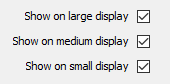
By default and after an upgrade, all Corporater BMP objects except drill tables are set to be visible on each device type.
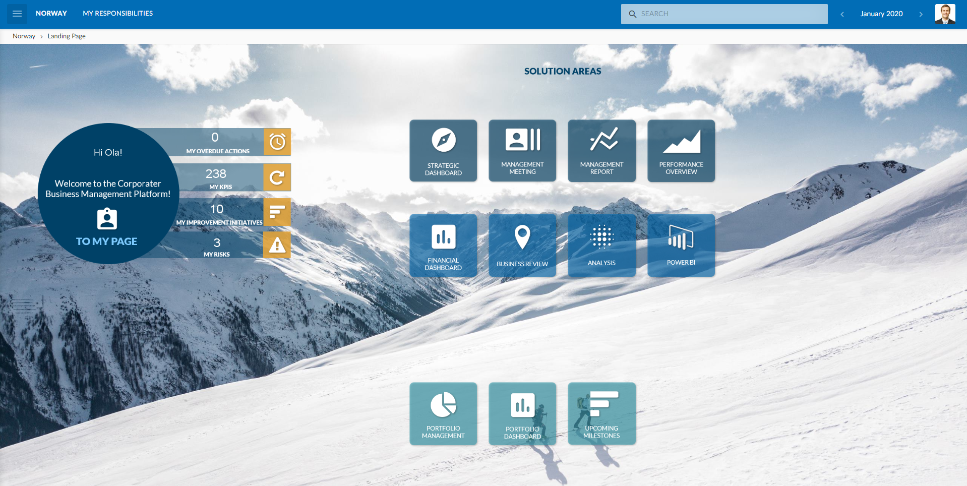
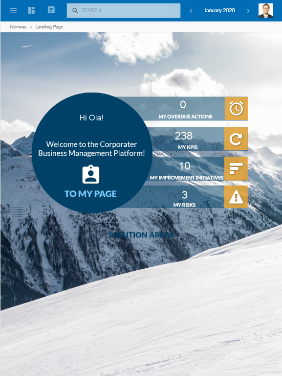
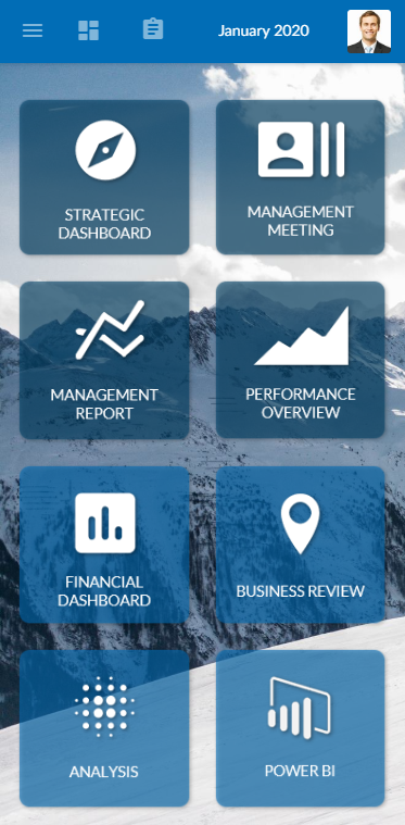
The following example presents a Scorecard on large, medium, and small device types.
- Desktop or tablet
- Tablet with Portrait page orientation
- Mobile